That Changed Everything!
Are you struggling to get traffic to your website?
Have you been told… if you build it… they will come?
Told that… if you build a good website and put out great content that people will start reading what you write?
So you go do it, right?
You create a good looking website. No… a GREAT looking website.
Then you start writing great stuff and putting it out there. One article, two articles, three articles. Ten articles and more. Next thing you know waves of traffic start coming… or so you thought.

Nothing. Nobody. Not even mom. It’s just one long empty road!
Where’s the traffic? Where are the visitors, the prospects, the customers? No one seems to be reading your content!!!
And you spent so much time and effort writing it!
What’s going on?!?
Well here’s the thing, a good website with GOOD content that is updated regularly will still take time to get found online. It could take months and even years depending upon how much you write, how good your content is, and how competitive your niche is.
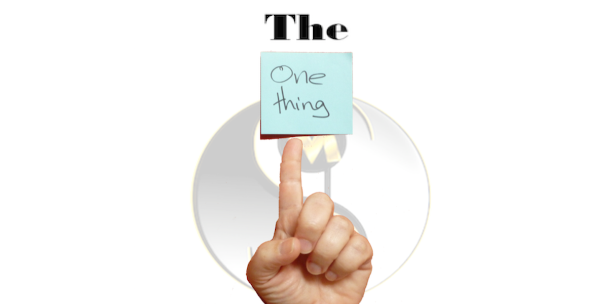
Fortunately, for you, there’s one thing you can do to help get your site seen and more importantly, read!
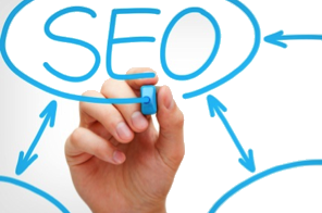 And yes, there are courses upon courses written about Search Engine Optimization or SEO, backlinking, domain age, website reputation, Social Media Strategy, and many more things to get your site noticed online.
Yet… there’s still one thing you can do that will quickly and easily get more visibility to your site than many of these other methods combined.
Do you know what that is? Well keep on reading and find out.
But first, a small disclaimer…
This one thing is not a miracle pill.
If you implement it properly, it can be an incredible tool and create an incredible boost in your traffic and reader engagement. And of course if you don’t implement it properly, it could make things worse. So make sure you use this powerful technique properly, because when you do you’ll be amazed with the results.
First, as we said earlier, it’s important to understand that there are many things that can increase traffic, engagement, and conversions on your website. Some of these things might include:
- Reputation of the author.
- Number and quality of incoming links.
- Age of the domain.
- Social media strategy.
- Originality and freshness of content.
All these things can factor into your website rankings and visibility of your post.
Yet… the one thing, the most effective thing you need to know in order to attract traffic in droves and increase engagement on your website is…
Drumroll please…
A powerful, client-attracting, attention-getting headline!
The 5 Second Rule – No 8
Studies show that you have less than 8 seconds to capture someone’s attention and get them to take further action! And only the right headline can do this and help get your site found online.
Our Average Attention Span Is Now 8 Seconds –
1 Second Less Than A Goldfish
— National Center for Biotechnology Information at the U.S. National Library of Medicine

Yes, we know, we know what you’re thinking… well, an amazing picture can do the same thing. Especially sexy pictures, cute pictures, funny pictures, or just even outrageous, unbelievable pictures! And let’s not forget cute and funny cat pictures.
And yes… you’re right… pictures can definitely capture someone’s attention…
But… it’s a headline that will keep readers engaged, peak their interest, and get them to read further through your site. It’s the headline that will get them to take further action.
Journalists call them headlines; SEO Experts call them titles and headings; Email Marketers call them subject lines; Whatever you call it, they’re words that convey to your audience that your article, site, email, message, blog is something that they want… no they need… to read!
Your headline or title is often a reader’s first interaction with your brand, so it’s critically important to get it right. Not only so reader’s keep reading, but to convey the proper message to your audience. Copyblogger says that your headline is the single most important element of your message. So make sure you get it right!
Link Baiting
But beware… there’s a thing called improper link baiting though! Link bait is any content or feature on a website created for the purpose of gaining attention or encouraging others to link to or share a website or post. It becomes improper when the quality of the content being linked to is rather poor, or when your content doesn’t really match the headline that brought people to your content.
While this sounds like it’s a good strategy, Facebook is cracking down on it when it’s not done right, the improper type. Therefore, it is important that the headline or title actually relates to the content you’re writing and isn’t there just to get people to read something. So don’t make your headline sound like it’s spam, and don’t point to really poor content either.
Powerful Headlines Elicit Emotional Responses
 A powerful headline has to elicit an emotional response from the reader. It’s got to pique interest, create shock, awe, surprise. It’s got to muster a person’s curiosity. It’s got to motivate the person to keep on reading further.
Having the right headline can make the difference between getting read and getting forgotten. So focusing on having powerful headlines to attract reader’s attention will result in greater engagement, higher conversions, and of course, more sales.
Headline Hero
Just so you know, we’ve only covered the tip of the iceberg when it comes to headlines in this post.
We have more tried and true headline types and templates that you can use, which make creating potentially viral headlines brain-dead simple. You can get a few of them in our short headline report called “Headline Hero: How To Get More Traffic, Increased Engagement, and Better Conversions.”
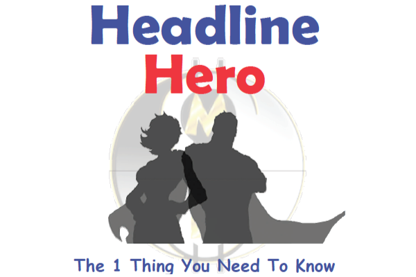
Get your copy of our short and powerful Headline Hero report now. And don’t forget to watch this quick video to learn even more secrets about increasing conversions that will jumpstart your website attraction and stop frantic surfers in their tracks, compelling them to stay on your site and get engaged.
The Law Of (Website) Attraction
Of course, once you’ve learned the importance of headlines, you’ll want to learn how to use them to create an optimized, responsive website that attracts hoards of interested prospects and engaged visitors. All of this and more will be covered in our LIVE Website Attraction Formula training.
They’re suppose to attend a full day of live training where they will learn…
- The step-by-step approach to creating their own award winning, OPTIMIZED, website for their business using pre-made templates.
- How to add plug-ins to increase the functionality of their site with just a few clicks of the mouse.
- How to add social icons, images, video, and more.
In fact, in addition to all this and more headline secrets, they will also learn about…
- Search Engine Optimization
- Sales Funnel Creation
- And Website Copywriting
And they don’t need to worry. Even if they know nothing about any of these topics or website code they won’t be lost or overwhelmed, because this full day hands-on training is designed for the beginner who knows almost nothing about websites, as well as, for those who have experience and just don’t know why their site is not performing like they want.

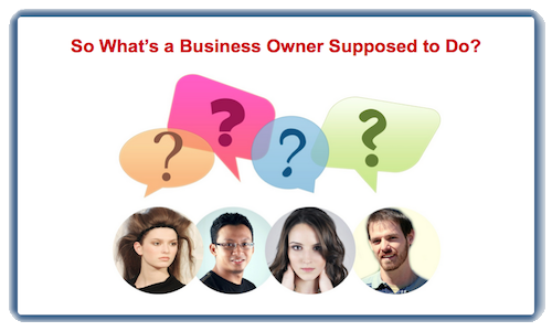
So what’s a business owner going to do?
They’re going to find out more about the Website Attraction Formula LIVE Workshop training and sign-up today!